Craft beer shelves these days look less like supermarket aisles and more like art galleries throwing elbows. Every brewery wants to be louder, weirder, hoppier than the next. Drinkers are spoilt for choice, distracted, and frankly a bit fussy. Standing out is not optional anymore, it is survival on a wet shelf in Dan Murphy’s.
Smart, well-designed beer labels give breweries an unfair edge in a market that punishes the forgettable. They turn cold storage browsing into actual hand-reaching, cart-loading, repeat-purchasing behaviour. A clever label tells the story before the first sip, builds curiosity at three paces away, and earns shelf real estate that bigger budgets cannot always buy through marketing spend alone.
Shelves Today Are a Visual Brawl
Buyers Decide in Three Seconds Flat: Most drinkers do not stand around weighing options like sommeliers. They scan, judge, and grab their preferred brew. Eye-tracking research from beverage retail keeps proving the same brutal truth, decisions land somewhere between three and seven seconds. Your label gets one shot to interrupt that fast-moving scroll and earn a second look from a real buyer.
Competing With Hundreds, Not Handfuls: Australian bottle shops now stock anywhere between two hundred and a thousand individual beer lines, depending on size. That means your six-pack is fighting for attention against everything from glossy multinationals to garage breweries with surprisingly slick packaging. The volume of competition has changed the design game entirely, blending in usually with equals losing.
Generic Designs Cost Real Money: Bland packaging is not a neutral choice, it is a quiet revenue killer. A brewery pouring its soul into a triple-mashed stout deserves more than a default font and a stock illustration of a hop cone. Every weak label is a missed sale, a forgotten brand moment, a customer who picked up something shinier next to it.
Personality Is the Real Hop Bomb
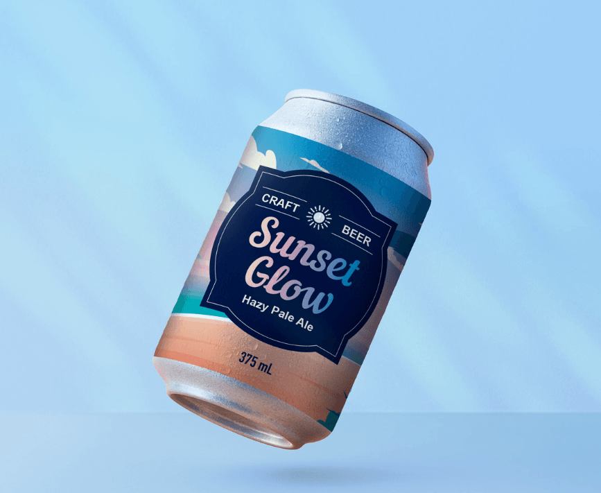
Colour Choices Are Doing Heavy Lifting: Beyond looking pretty, colour decisions on a beer label trigger memory, mood, and instant category guessing. Solid grounding in colour psychology helps brewers signal hazy versus crisp, bitter versus sweet, fun versus serious, all before anyone reads a word. Smart breweries stop guessing and start using colour the way songwriters use chord changes.
Typography Whispers Your Whole Vibe: A typeface is rarely just a typeface. Hand-drawn lettering says small-batch and crafty, condensed sans serifs lean industrial, scratchy fonts suggest punk attitude. Type choices set tone faster than a tagline ever could. Get this right and drinkers feel the brewery’s personality before they even register what style of beer is inside the bottle.
Illustration Beats Stock Photos Every Time: Original artwork is becoming the new minimum standard for craft beer that actually wants to be remembered. Custom illustrations create ownable visual cues loyal to a single brand, no other brewery can lift them by accident. That small investment in art often outperforms thousands spent on later social campaigns chasing the same eyeballs.
Finishes That Refuse to Be Ignored
Premium Stocks Change How a Beer Feels: Touch matters more than people admit. A textured uncoated stock signals craft and care the second a drinker lifts the bottle. Pair smart material choices with sharp brand storytelling and the label starts working overtime, suggesting flavour intensity, brewery values, and price tier in one quiet tactile moment on the shelf.
Specialty Effects Earn the Double Take: Synthetic silver stock can mimic the glamour of foiling without the cost or environmental baggage of traditional methods. Matte and gloss laminates each carry their own personality, soft and confident versus loud and proud. A few smart finishes turn an okay label into something drinkers want to photograph for their feed.
Durability Earns Quiet Respect: Beer labels live a tough life, ice baths, condensation, cold fingers, sweaty eskies on hot afternoons. A label that warps or smudges after one cold soak undoes every clever design choice made earlier. Choosing the right stock and laminate combination keeps artwork crisp from brewery floor to fridge door, protecting both the visual and the brewery’s hard-earned reputation.
Standout finishes worth knowing:
- Synthetic silver stock for a foiled effect without the environmental baggage of traditional metal foiling techniques.
- Matte laminates for understated craft brands with a serious following.
- Gloss laminates when colours need to scream from two metres away across a busy fridge aisle.
- FSC-certified paper stocks for breweries that wear sustainability proudly and want eco-aware shoppers to notice.
- High-contrast type pairings for readability inside chilled bottle fridges.
Smart Spends That Pay Their Way Back
Label Investment Beats Most Ad Spend: A clever label keeps selling for years without monthly invoices, agency fees, or platform algorithm changes. Compare that to social ads draining budgets every fortnight with nothing physical to show. Every bottle on every shelf becomes a tiny billboard that does not ask for a top-up after thirty days of running.
Reorders Tell the Real Story: Bottle shop buyers reorder what moves. If a brewery’s six-pack is constantly walking out the door, those orders grow, shelf positions improve, and new venues come knocking. Strong labels accelerate that whole flywheel. Forgettable ones leave inventory gathering dust until someone decides the SKU is just not pulling its weight.
Small Tweaks Lift Lifetime Value: Iterating label design across seasonal releases keeps loyal drinkers curious and new buyers intrigued. Limited runs with refreshed artwork build a collectability factor, encouraging fans to grab more than they planned. Smart breweries treat each release as a chance to deepen the relationship, not just sell another carton of the same old thing twice.
See also: How to Explore New York Efficiently: Smart Time Management Tips
Cans Worth Reaching For
Standing out is a design problem before it becomes a sales problem. The breweries growing fastest right now treat labels as the front line, the loudest spokesperson on a crowded shelf. Better label design pays back in pickups, reorders, and repeat fans for years. Request a quote online from a quality Australian label printer and start winning the shelf.